Themes & Branding
Switch themes and customize your app's colors, fonts, logos, and assets from Studio.
Overview
Studio's branding tools let you make a SiteKnock project look like your product. Switch between themes and customize the visual identity — colors, typography, logos, and assets — with live updates.
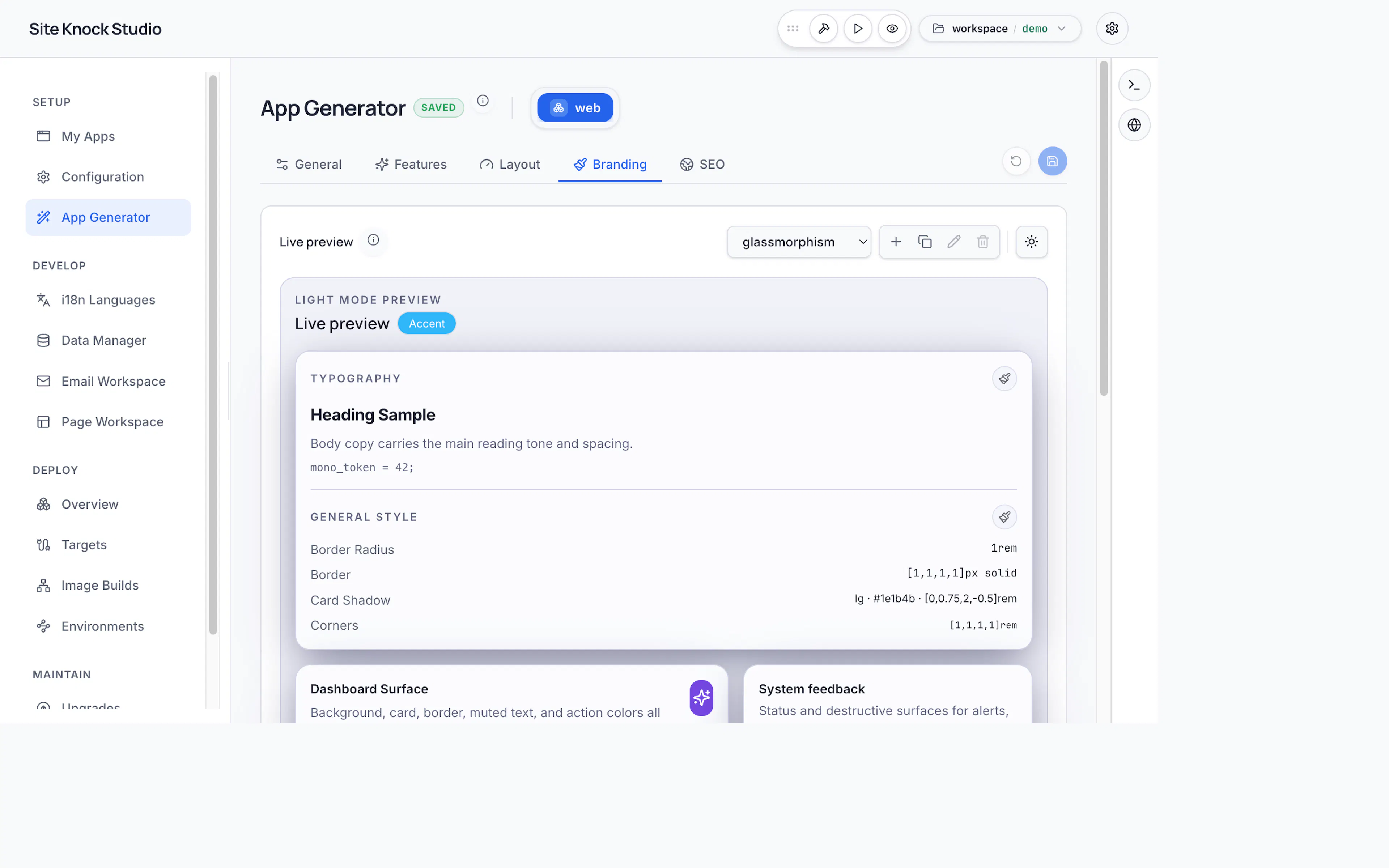
Themes
Switch your app's theme to change its overall look and feel. Themes control the color system (light and dark), spacing, and component styling. Branding is stored per app in config/<app>/branding.jsonc, so different apps in the same project can have distinct identities.
Branding
Customize the details that make the app yours:
- Colors — primary, accent, and semantic colors for light and dark modes.
- Typography — heading, body, and monospace font families.
- Logos — upload light and dark logos and a favicon.
- Assets — upload images and other brand assets via the image upload control.
Light and dark mode
SiteKnock apps support light and dark themes out of the box. Define both palettes in branding so your app looks right in either mode and respects the user's system preference.
Set your brand colors and fonts once in Studio — they flow through every page, dashboard, email, and component automatically.